Banners ads are more than just a simple way for you to promote your brand in the online space today; they’re generally the first touch point between potential customers and your product. The typography ties it all together, to ensure your banner ads really pop. The font you use and the way you utilize it are critical for improving readability, retention, and click-throughs. Being foremost Digital Marketing agency in Rawalpindi, Islamabad, Pakistan Web Technologies Pakistan knows exactly how to create the banners which are visually appealing and converting!
The Importance of Typography in Banner Ads
Typography is not a mere choosing of a typeface; it is how your message’s tone is communicated and grabbed the attention to. The right font says a lot about your brand personality, it increases readability and it is used to direct the viewer’s eyes to the most imperative aspects of your ad. Banner ads are usually only glanced at for a few seconds, so you need to establish an immediate visual impression.
Bad typography, on the other hand, can alienate the reader, water down your message and even damage your brand’s image. So it’s essential that you know the fundamentals of how to choose greeting cards businesses fonts, how to share the font sizes, in what are some trade secrets and also how to manipulate spacing and alignment.
Selecting the best Fonts for Banner Ads
The first step to designing successful banner ads is picking the right fonts. Here are some key considerations:
1. Legibility First: Readability should always supercede appearance. With a clean, easy-to-read sans-serif such as Arial, Helvetica or Montserrat being particularly well suit to digital screens. For banners with little text, thick and simple font can give a pungent performance.
2. Consistent with the Brand: Make sure your font selection is consistent with your brand identity. A modern tech company may decide to go for a sleek, futuristic font, while an insurance firm will be more inclined to choose a bold serif such as Times New Roman. Andensuring that the look is consistent across all marketing materials will helpprofessionals reinforce their brand.
3. Font Pairing: Mixing and matching fonts is one way that you can add visual appeal, but don’t just be lazy about it. Choose a Headline Font That’s Eloquent Create contrast and hierarchy by combining a loud headline font with a simpler body font. Midway – don’t have more than 2 or 3 different typefaces in your banner for a professional look.
4. Stay Away From Overused Fonts: Such as Comic Sans or Papyrus, these are basic fonts that get over used and can make your brand appear less valuable. Unique or premium fonts can be that new, professional appeal for your banners.
Typography Tips for Maximum Engagement
More than simply selecting the right fonts, is how you use typography in your banner ad that can either make it or kill it. Here are a few tips from our digital marketing agency in Rawalpindi to help you out:
1. Prioritize Readability
- Make use of big fonts on headlines because that will help convey your message even at a taking look.
- Contrast text with background according to your palette. Readability, for instance white text on a dark or inverted light background.
- Don’t use fonts that are overly complex or decorative in the main message, as these may distract and confuse recipients.
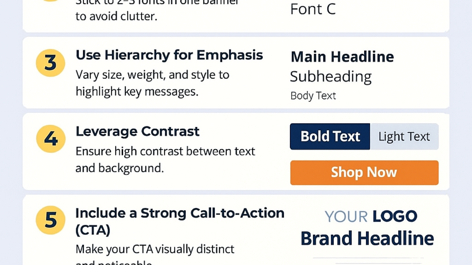
2. Establish Visual Hierarchy
The answer lies in a designated hierarchy that steers the reader toward the CTA. Techniques include:
- Hierarchy of Sizes: Your headline should be the biggest, your subheads medium and your body text smallest.
- Hierarchy of Weight: Use bold weights for headlines and a lighter style for subheads.
- Hierarchy of colour: accent with colour for emphasized phrases or picks, while everything else remains neutral.
3. Keep It Short and Punchy
Banner ads face constraints on space and time to attract users’ attention. Use concise, action-oriented language. EDU -Typography should highlight important words not dilute the design with too much text. The former typefaces paired with few words pack a big punch.
4. Mind the Spacing
- Leading: Enough space between the lines to make it readable. Crowded text can overwhelm viewers.
- Letter Spacing (Kerning): Increase/decrease space between letters for a uniform and professional look. Letters that are too tight will look clogged while letters that feel to far apart may appear disjointed.
- Margins and Padding: Make sure that no text touches the edge of the banner edge. Margins are necessary to maintain a neat and ordered look.
5. Optimize for Different Devices
Banner ads can be seen on both desktop and mobile devices. Fonts have to be readable on all digital and mobile screens. Elevate your banners to the next level with high quality animation (including intro/outro animations), stunning visuals, and eye-catching designs. Harness the power of HTML5 with dynamic, fully customizable banner ad templates. Take full control over individual elements of your design & easily create unique branded banner ads. Work on multiple banners at once without any fear of losing changes or progress.Use responsive design principles to make sure your banners look great wherever they is placed puoied!
6. Emphasize the Call-to-Action (CTA)
Your CTA is the kingpin of any banner ad. All things to make you differentiate with font, color, weight instead. For instance, it’s hard to miss a bold, vibrant button with an obvious directive like “Shop Now” or “Learn More.”
7. Experiment with Typography Styles
Repetition is one thing, but adding some subtle stylistic flare can hook people as well:
- Italics or slanted text: Emphasizes certain words or phrases.
- Uppercase vs. Lowercase: Like the conundrum over all caps or no caps, uppercase looks urgent or important while lowercase can feel friendly and approachable.
- Effects on Text: Shadows, such as drop shadows, outlines and gradients All these aids can be helpful to make the text more readable but should be used sparingly so they do not distract from other elements of the slide.
Common Typography Mistakes to Avoid
You’d be surprised by the number of great designers that can get caught in typography pits. Here are some downsides to look out for:
- Excessive Use Of Fonts: It leads to inconsistency in visual, resulting in poor readability.
- Disregarding Contrast: If there’s not enough contrast between your text and background, users will struggle to read your message.
- Dense Text: The more details you try to squeeze into the frame, the harder it is for your audience to retain your message.
- Overlooking the Mobile Experience: What looks great on your desktop might be unreadable on a smaller screen.
Typography & Banner Design Tools
Designers will use design tool & resources to have beutifull banners. Tools such as Adobe Photoshop, Illustrator and Canva can provide a choice of fonts to use for your design, allow you to adjust spacing at ease; they also give the ability of preview. Also, Google Fonts and Adobe Fonts have a variety of fabulous fonts for digital advertisements.
FAQs
1. What role does typography play in banner ads?
Typography is extremely important in banner ads and directly affects the readability, engagement and appearance of your brand. Clear and suitable fonts assist for an effective expression of your message as well, catch the eye of the viewers in few moments.
2. What are good fonts to use for banner ads?
All the fonts that are sans takes of list (specified by 1 and 2) will be great for a banner ad like Your choice of Arial, Helvetica or Montserrat. Using a typeface of heavy headline size and weight with not too distracting body font will establish the visual hierarchy and interest of the ad.
3. How can I improve readability of the text ad in my banner?
Make text easy to read using large fonts with text/background contrast, the right spacing of lines and words, but don’t clutter up a line with too many words or font types.
4. What impact does typography have on click rates?
Good typography will direct the user’s attention to important elements, such as headline or a call-to-action (CTA). Fonts that are simple to read and aesthetically pleasing prompt users to engage and take a desired action, leading to increased clicks.
5. Can I update the fonts used in my banner ads to be better on mobile?
Yes, responsive typography is the practice of making sure that fonts are readable on a variety of screen sizes. You can tweak the font sizes, letter spacing and contrasts to read well on mobile and ensure that your banner ads are working wherever they’re seen.
Conclusion
Good banner ads rely on typography as well. From choosing the right typefaces to determining visual hierarchy and maintaining legibility, every typographical decision affects viewer interaction. Being a reliable Digital Marketing agency in Islamabad, Rawalpindi, Pakistan we make sure that your banner ads not only are professional looking but that it also delivers you the Return on investment.
Through the use of great fonts, beautiful spacing, responsive structures and strategically placed CTA’s you can optimize banners to catch your users’ eye, communicate your message and call them to action. By following these typography tips you can make your brand more visually appealing, generate higher click throughs and create more effective marketing.
Whether you are marketing a product, service or brand, understanding typography is essential to make your work stand out in today’s overcrowded digital world. Collaborate with Web Technologies Pakistan to create eye-catching banner ads that are creative, visually appealing and conversion-centric for the best results.